Hello.
In this document, you will find guidance for using our visual elements, as well as an introduction to the strategy that informs them. Using these standards consistently in everything we do will help to build and protect the Data Lab brand.
Data Lab Identity Guidelines
Web Version
Imagery - Appropriate Use
Our Photographic Identity
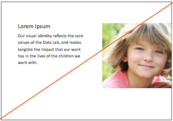
Our visual identity reflects the core values of the Data Lab, and makes tangible the impact that our work has in the lives of the children we work with.
Stock photos are carefully selected to convey the diversity and vibrancy of those who we strive to help with our work, so its important to use only these images and not source your own. Any images added to this collection must be approved by the Data Lab administrative team.


Imagery - Inappropriate Use
Rescaling
Do not stretch, skew, or distort the images to fit within a document. If necessary, resize or crop the image to fit the publication you are working on.
Full Bleed Images
For internal documents, avoid unwanted white borders when printing by not using full-bleed or partial-bleed images that reach the edges of the document. Full bleed images should only be used for professionally printed materials like pamphlets and posters, or images that will only be viewed in PDF form online.


Typography
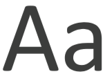
Primary Fonts
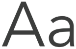
Both Calibri and Avenir Next are ‘humanist’ sans-serif typefaces, giving them a warm and soft character while maintaining excellent legibility at small sizes.
Geometric construction contrasted by a slight rounding at the corners make Calibri an ideal font to convey the Data Lab’s commitment to rigorous science and accesible presentation. Avenir Next has a sharper presence that works well for display text and headers.
Secondary Fonts
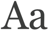
Georgia is a relatively ornamental serif font that has a book-like feel, and can be employed as an alternative typeface for shorter publications like the pamphlet example in this guide.
Calibri
Lorem ipsum dolor sit amet, in sale etiam postea vim, cum altera percipit temporibus ea.
Avenir Next
Lorem ipsum dolor sit amet, in sale etiam postea vim, cum altera percipit temporibus ea.
Georgia
Lorem ipsum dolor sit amet, in sale etiam postea vim, cum altera percipit temporibus ea.
Color
Primary Palette
These colors have been chosen from the University of Michigan color guide to portray the vibrant culture of the Data Lab, and reflect a youthful energy while remaing professional and subdued. Look to the Iconography section of this guide to pair these colors with our core values.
Secondary Palette
Secondary colors include the University signature maize and blue, as well as an accent grey for body copy and general contrast.
226, 84, 25
#E25419
0, 63, 89, 11
168, 166, 4
#A8A604
0, 1, 98, 34
82, 169, 159
#52A99F
51, 0, 6, 34
79, 47, 124
#4F2F7C
36, 62, 0, 51
255, 255, 255
#FFFFFF
0, 0, 0, 0
117, 117, 117
#757575
0, 0, 0, 54
255, 203, 5
#FFCB05
0, 20, 98, 0
0, 39, 76
#00274C
100, 49, 0, 70
Logo Options
Minimum Clearspace
Our wordmark logo is the cornerstone of our Identity, and must be allowed enough clearspace to make an impact on our print and digital publications. Provide a margin equalling at least the height of the logo wherever it appears.
Logo Variations
Various options for the logo are available. When selecting a logo, consideration should be given to whether the logo is inward or outward facing, space availability, and which elements should be emphasized. For example, sometimes “Child and Adolescent” is significant to the audience. At other times, “Data Lab” is the desired focus.
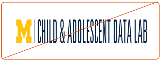
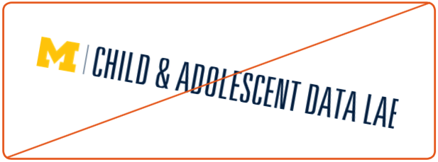
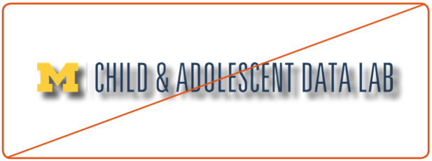
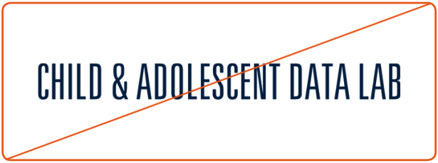
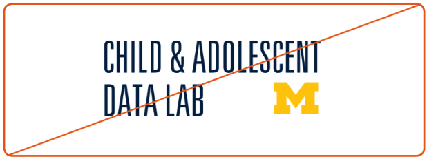
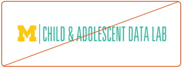
Logo - Inappropriate Use
Preserving Our Brand
Our wordmark and signature logos must remain consistent in their appearance across a range of publications and media. Follow these guidelines to ensure that the logo has been adequately presented in your publications.
Do not stretch or shrink the logo
Do not rotate the logo
Do not add graphic effects to the logo
Do not use signature marks without the block ‘M’
Do not reformat or crop the logo
Do not alter logo colors
Iconography
Describing Values
Our iconography tells the story of the Data Lab and its information pipeline before our audience has even read a word. Each icon conveys one of our four core values and employs a color from the primary palette found in the Color section of this guide. It’s important to be consistent with these color applications so that we can build strong associations with these values in the minds of our audience.
Future Icons
Icons designed for future applications should follow the conventions of these icons for the sake of consistency and legibility. Make sure the icon remains contained in its circular outline and maintain a bold enough line weight that the icon ramains legible at a small scale.

Data Driven Decision-Making

Innovative Data Solutions

Linking Allied Systems

Capacity Building
Graphic Elements
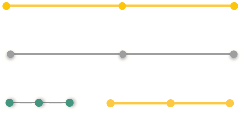
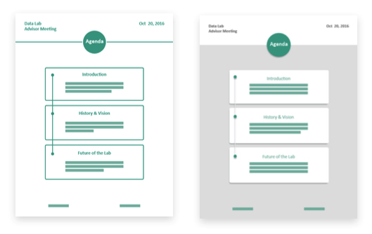
Connecting Information
Our line graph motif can add a touch of color to a text heavy document, and can be used as a bullet-point system to sequence textual information or phases of an experimental design. Designers may employ their own color choices from the Data Lab color pallette to meet the tonal values of each publication.
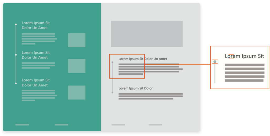
Usage & Sizing
The diameter of the points on our line graph motif should never exceed the x-height of the lowercase letters of the related header text. Make sure to indent the bulleted copy so that the line graph is aligned with left-side margin of the page.
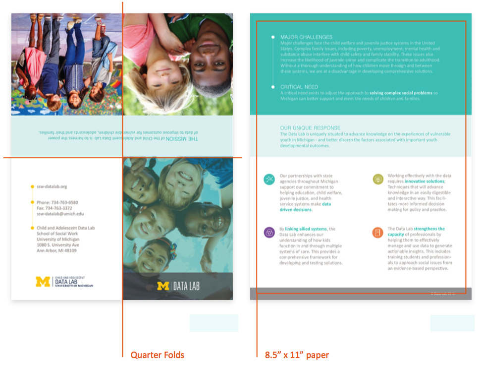
Pamphlets
Keep in Contact
Quarter-folded pamphlets are a cost effective and highly visible way to share updates about the Data Lab and explain various initiatives and research to visitors. They are particularly effective when placed in a card holder on our office doors or laid out on side tables in the School of Social Work.
A template for this pamphlet layout can be found below. Other pamphlets may be developed using principles outlined in this style guide.
Infographics
Communicating Research
Infographics are an important tool that allow us to tell a story about our research and initiatives to legislators, sponsors, and scientific peers.
Different research will dictate different layouts, so we have created a modular kit of visual and typographic elements that can be used to construct consistent graphics. They are available for download below. Use 11” x 17” tabloid paper for large scale infographics, and adjust the layout as necessary based on the intended audience.